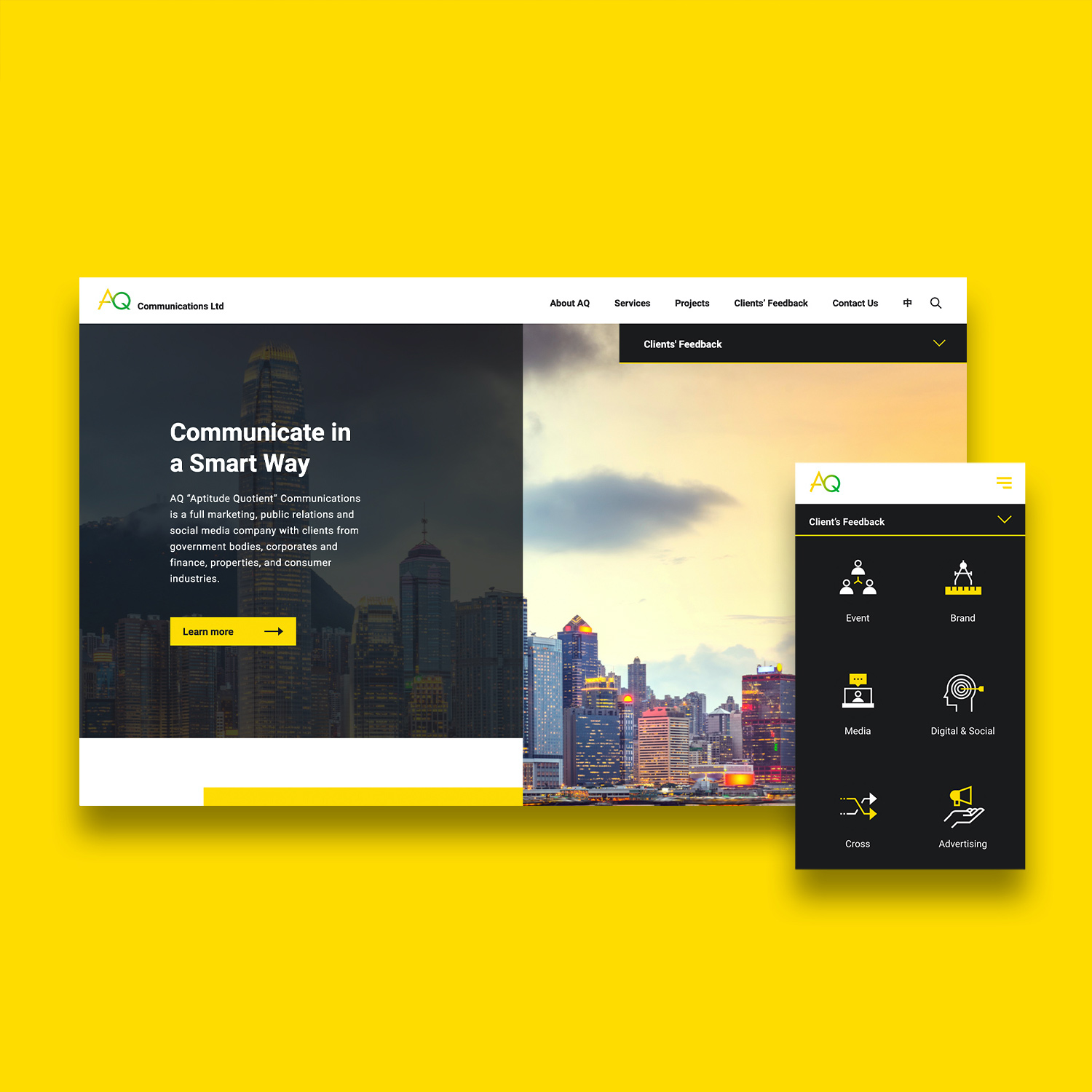
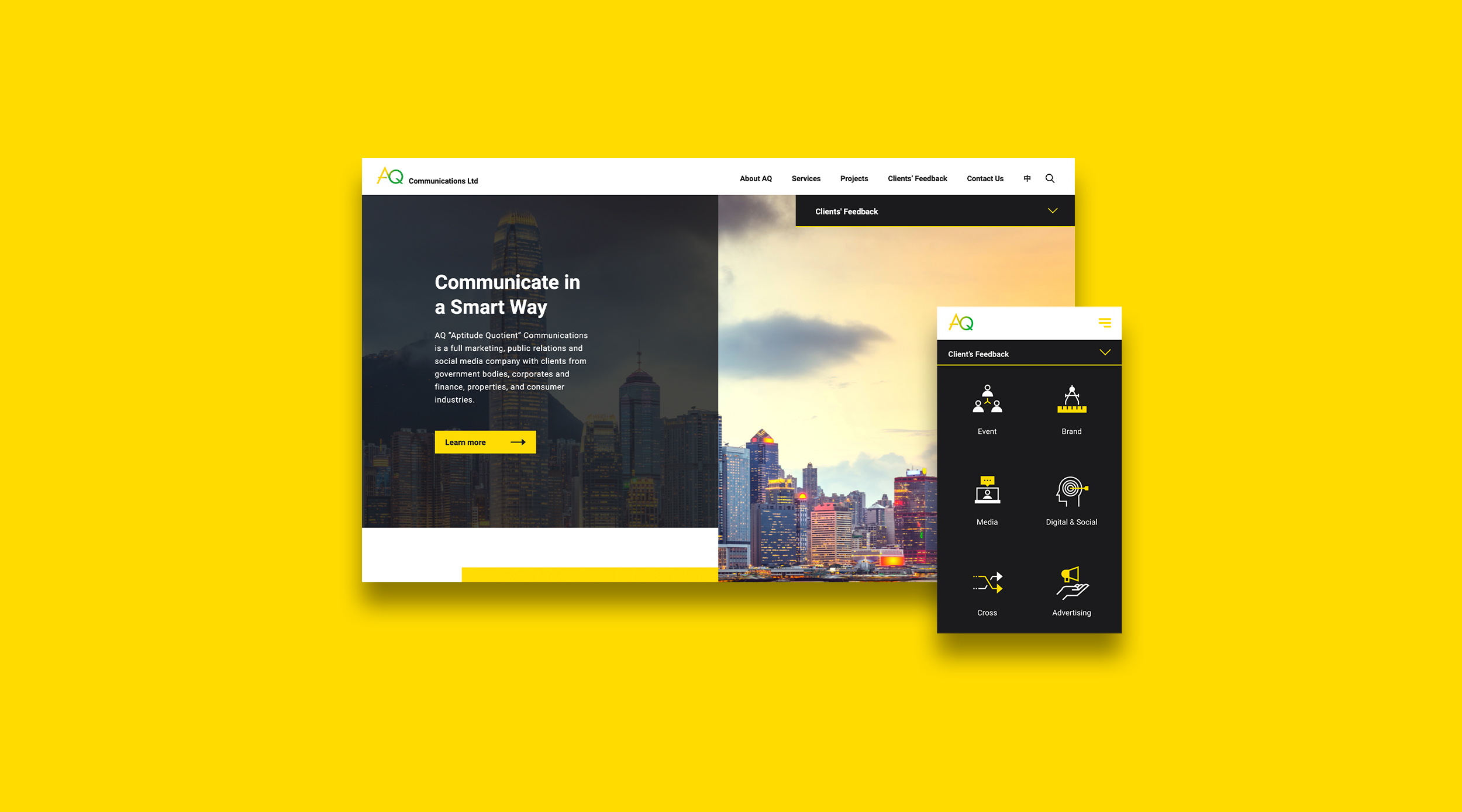
AQ “Aptitude Quotient” Communications is a Hong Kong-based company providing comprehensive marketing solutions to its clients. It is currently serving renowned clients in various sectors and helping them to outshine their competitors. To keep the consistency from AQ brand logo to website development, its current yellow colour was adopted as the theme colour of the website, black was also added to create a pop sense and build a reliable brand image.
Digital Strategy.
AQ Communications
Communicate in a Smarter Way


1
2
/ 2

Standing out from the Rapidly-evolving World.

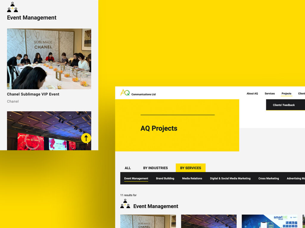
With the excellent services they provided, AQ constantly receives lots of compliments from their clients. To tailor-made the best website to promote their business, and highlight the clients’ feedback, we designed an outstanding pop-up comment box and pinned on every page as a characteristic. Besides, to showcase the collections of event photos professionally, we created a gallery section for each project, you can explore the details when you click on an image.