Case Study.
Wing Yuen
Infusing New Life to a 30-Year-Old Brand
1
2
/ 2
FROM DATA TO INSIGHT.
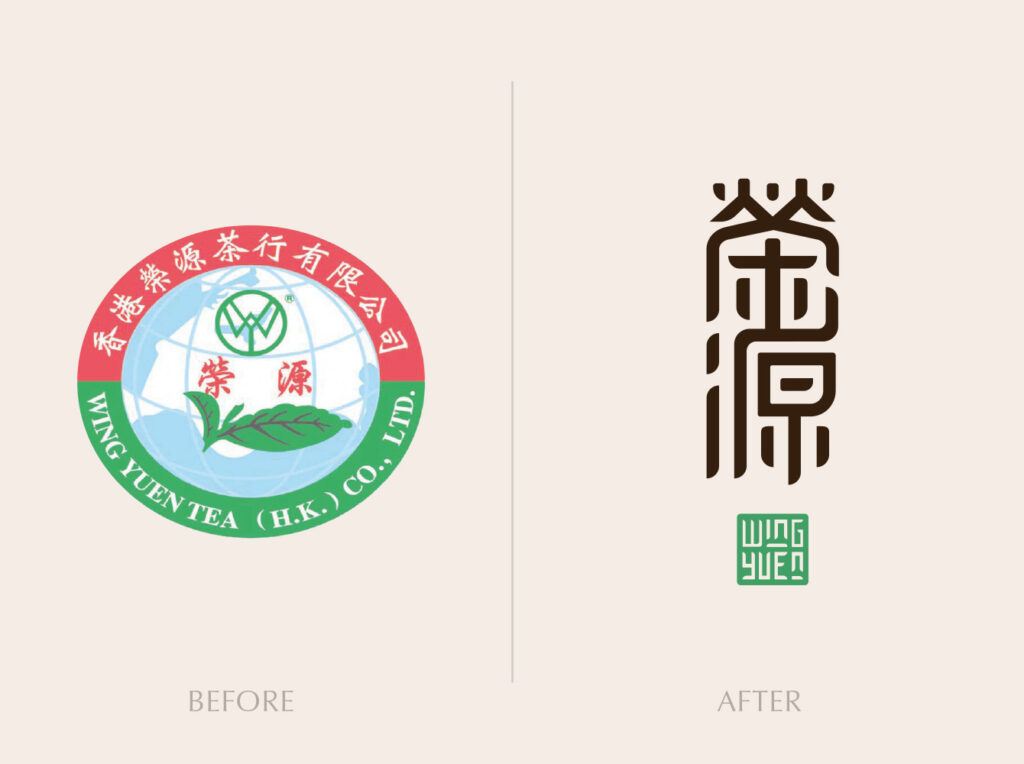
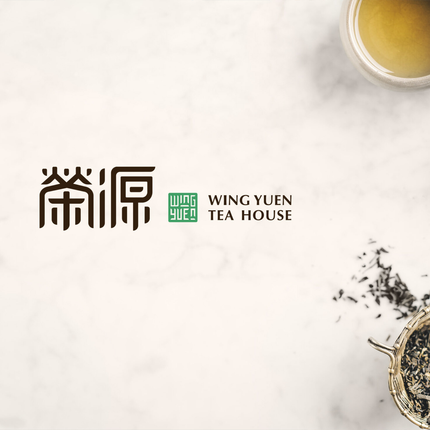
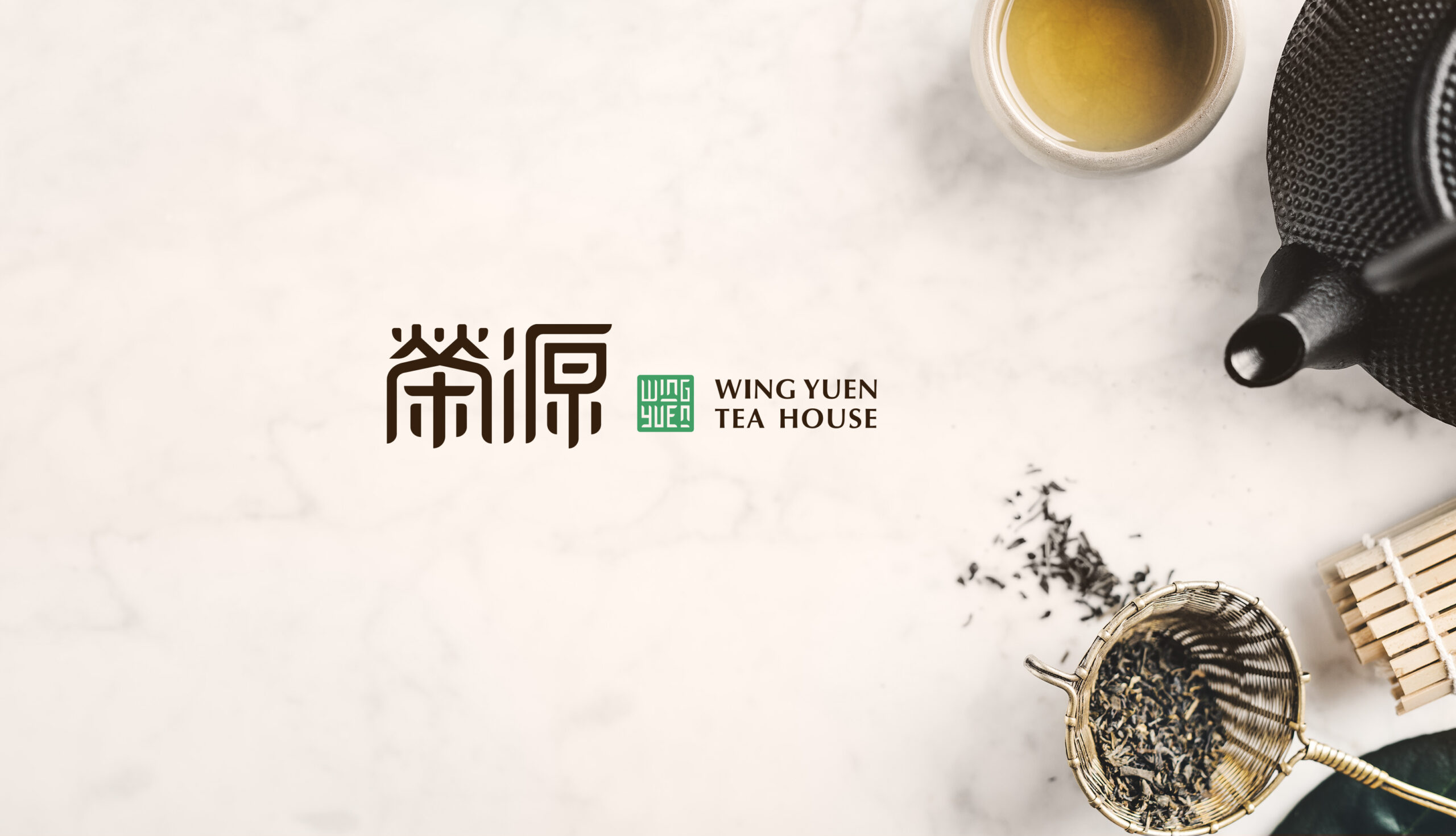
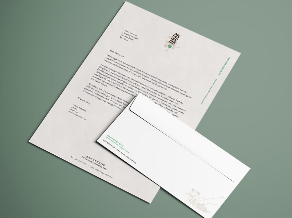
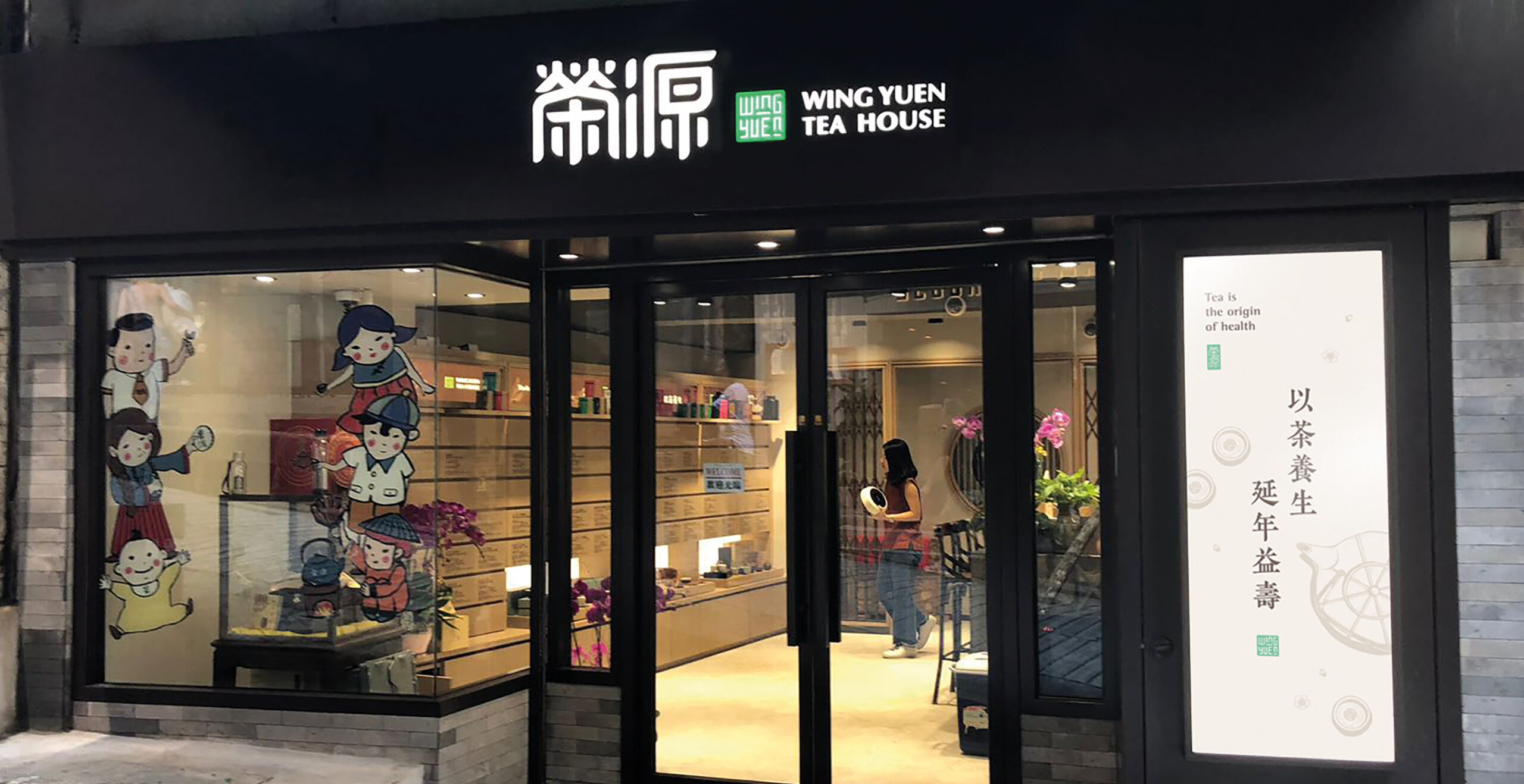
Brand Logo.
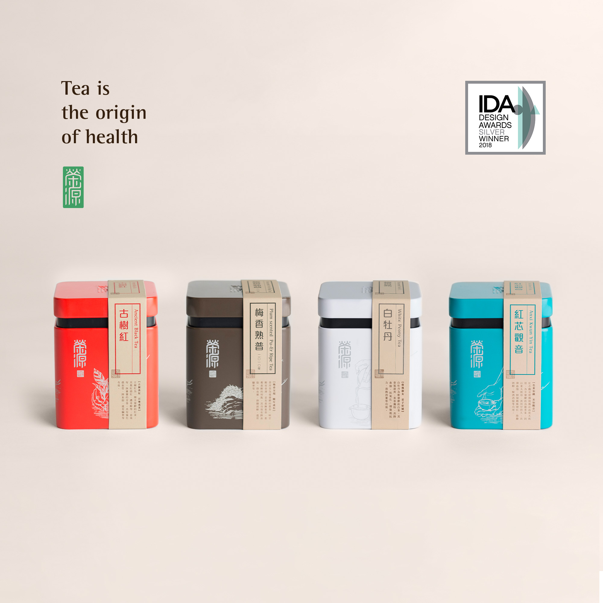
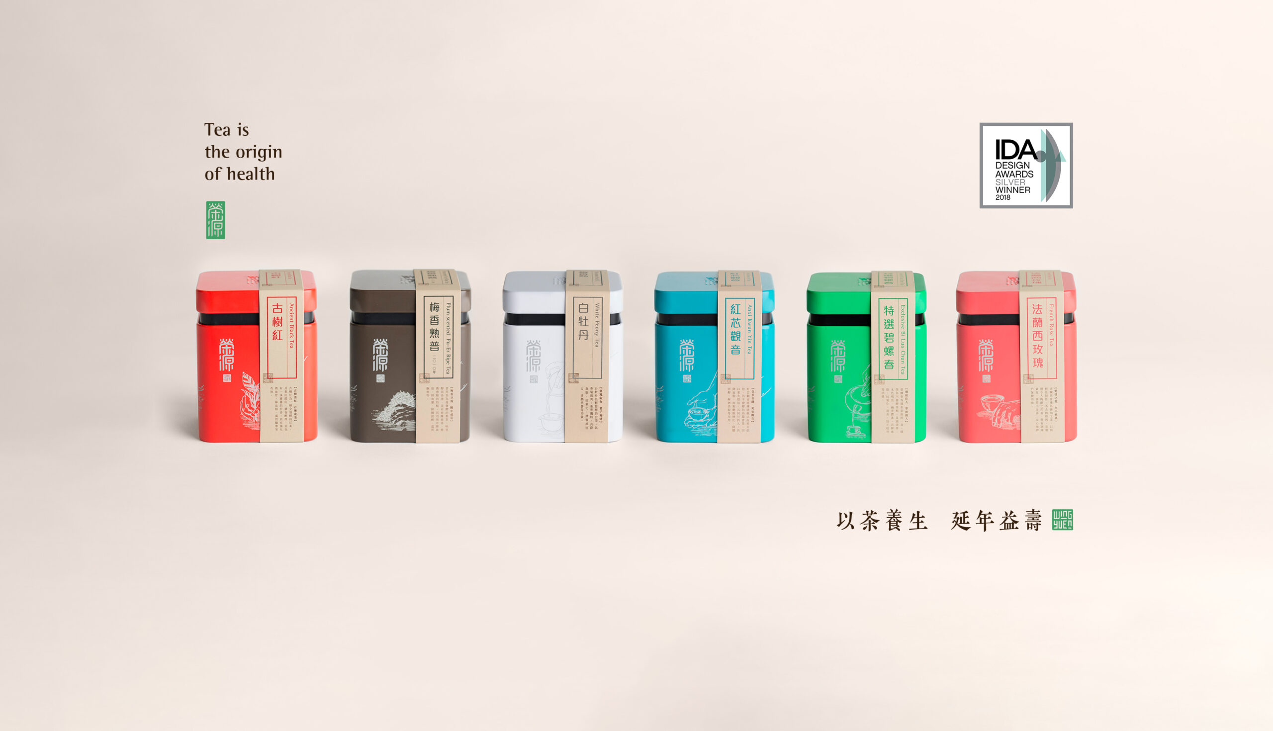
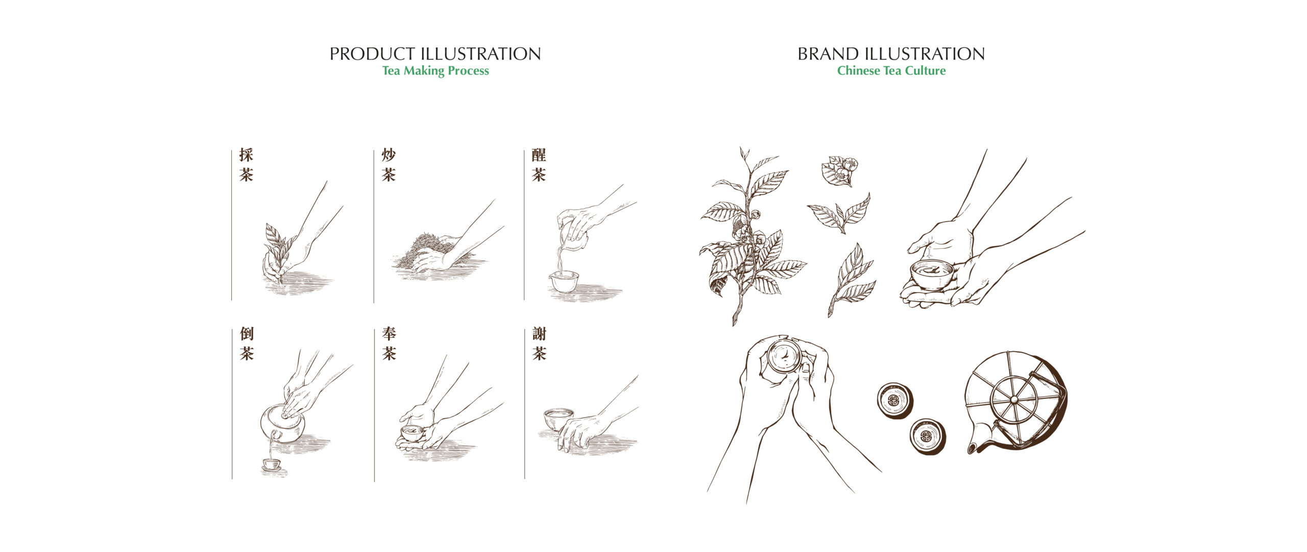
A unique logotype was created using the concept of the traditional Chinese seal as a tribute to Chinese Culture – as “Yuen” means having the consideration to the roots (飲水思源). The overall mood was calm, elegant and of reliable quality. The key graphics for the brand was a series of illustrations highlighting the process of tea-making, as Wing Yuen was all about education. The graphics allow the audience to understand the background of tea from the field to the cup.
Instore graphics once again communicates the tea-making process and slogan of the brand “Tea is the origin of Health” (以茶養生,延年益壽)through elegant illustrations, serving as visual cues to open the gate of tea culture to tourists and beginner tea-drinkers.
Results.
By understanding the market and the unique story behind the brand, we recreated a comprehensive brand identity to bring out the image of Wing Yuen as an open-minded tea master and educate the public about the story and culture of tea. We are pleased to announce this branding and packaging revamp project was one of the few selected as a Silver Award Winner in both the Corporate Identity and Packaging Category of the 12th (superscript) International Design Awards.